This was the first full-scale design project I completed during my apprenticeship with Bloc. I was given the challenge to create an application with no specifications or contraints except that the solution had to include features of organization, collaboration, sharing, and storing information.
While brainstorming ideas for this assignment, it just so happened that at the time a friend and I were struggling with managing all the details to plan an intimate dinner event and voila, the project was born!
UX Research, Content Strategy, UI Design, User Testing
User surveys, Competitive analysis, User personas, User stories, User flows, Wireframes, High-fidelity mockups, Clickable prototypes
Adobe Photoshop, Figma, UsabilityHub, GitHub, Zoom
2 months
It's 2019 and the ever-elusive work-life balance is a myth that fuels the dreams of young millenials and working professionals. If it's not easy to use, accessible, or simple then it's not worth your time.
People are currently struggling with all the different aspects of planning dinner events, often resorting to using multiple cloud storage platforms to manage all of their photos, text, and event data.
They need to find an easier way to store and access all event planning data and information in one place.
Let's eat gives users a solution for storing various types of data such as event information, invitee contacts, and event location data all in one place.
This eliminates the need for a user to search through or use multiple applications for different event planning information.
Given the inexpensive nature of online user surveys, the ease of accessbility, and the quick response time, I decided to conduct a user survey in order to find out more users' event planning behaviors.
Key factors that I wanted to examine were the different types of data files users interacted with, popular features, and user needs and frustrations.
Keeping in mind the key takeaways from the user survey, I conducted a competitive analysis between the most popular platforms. Even though the market place is super saturated for cloud storage platforms with event planning features, I found that users were still experiencing pain points in areas of accessibility, ease of use, and shareability of content.


Based on the user survey, the average user had a medium to high level of frequency and use with event planning platforms. In order to address the spectrum of potential users, I created three tiers of user personas based on level of involvement: low, medium, and high.
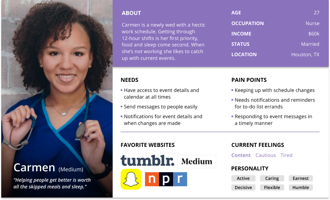
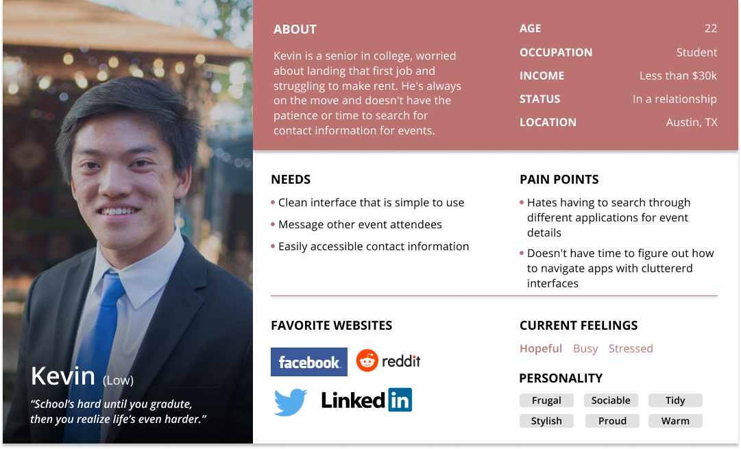


Tier: Low Involvement
Age: 24
Occupation: Student
Location: Austin, TX
"School's hard until you graduate, and then you realize life's even harder."
A graduating senior in college, Kevin's worried about landing that first job and struggling to make rent.
He's always on the move and doesn't have the patience or time to search for contact information for events.

Tier: High Involvement
Age: 27
Occupation: ER Nurse
Location: Houston, TX
"Helping people get better is worth all the skipped meals and lost sleep."
Getting through 12-hour shifts is Carmen's first priority, food and sleep are a close second.
When she's not working, she likes to lounge around and catch up with current events.
Based on previous research and user personas, I came up with different user stories for the application and ranked them based on importance. These are the tasks with the highest importance and the ones deemed necessary for a MVP (minimum viable product).


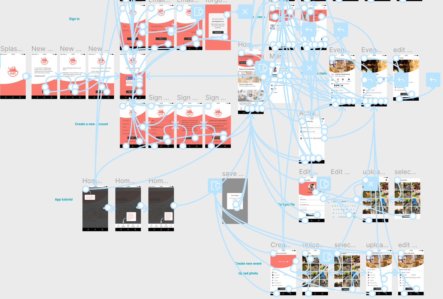
Create an account flow

Contact event guests, upload photos, and edit event details flows

Create an event and invite contacts flows
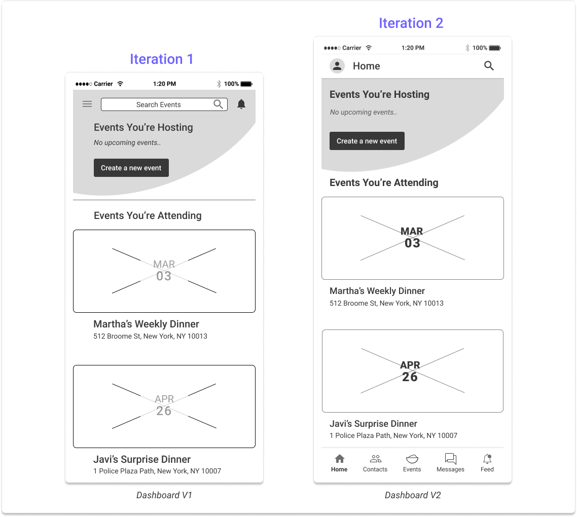
Next I sketched out some rough drafts of key mobile screens using inspirations from Facebook, Eventbrite, and Twitters' dashboard screens. After mapping out the screens, I translated them into my first digital wireframe iterations, keeping in mind that I needed to include the following features:


Initial wireframes based on the key user flows
Before moving on to the Branding phase, I needed to validate the assumptions I made in my first set of wireframes so I did some user testing for the three main user tasks: on-boarding, creating an event, and sending a message.

The first step in trying to solidify a brand identity for this app began with creating the logo. The journey to the perfect logo and color scheme really began when I went back to the root of the purpose of this app: to make a complicated process (dinner planning) simpler.
Since the application specifically caters to dinner planning, I wanted the logo to be very universal and easily relatable to the act of eating or dining.
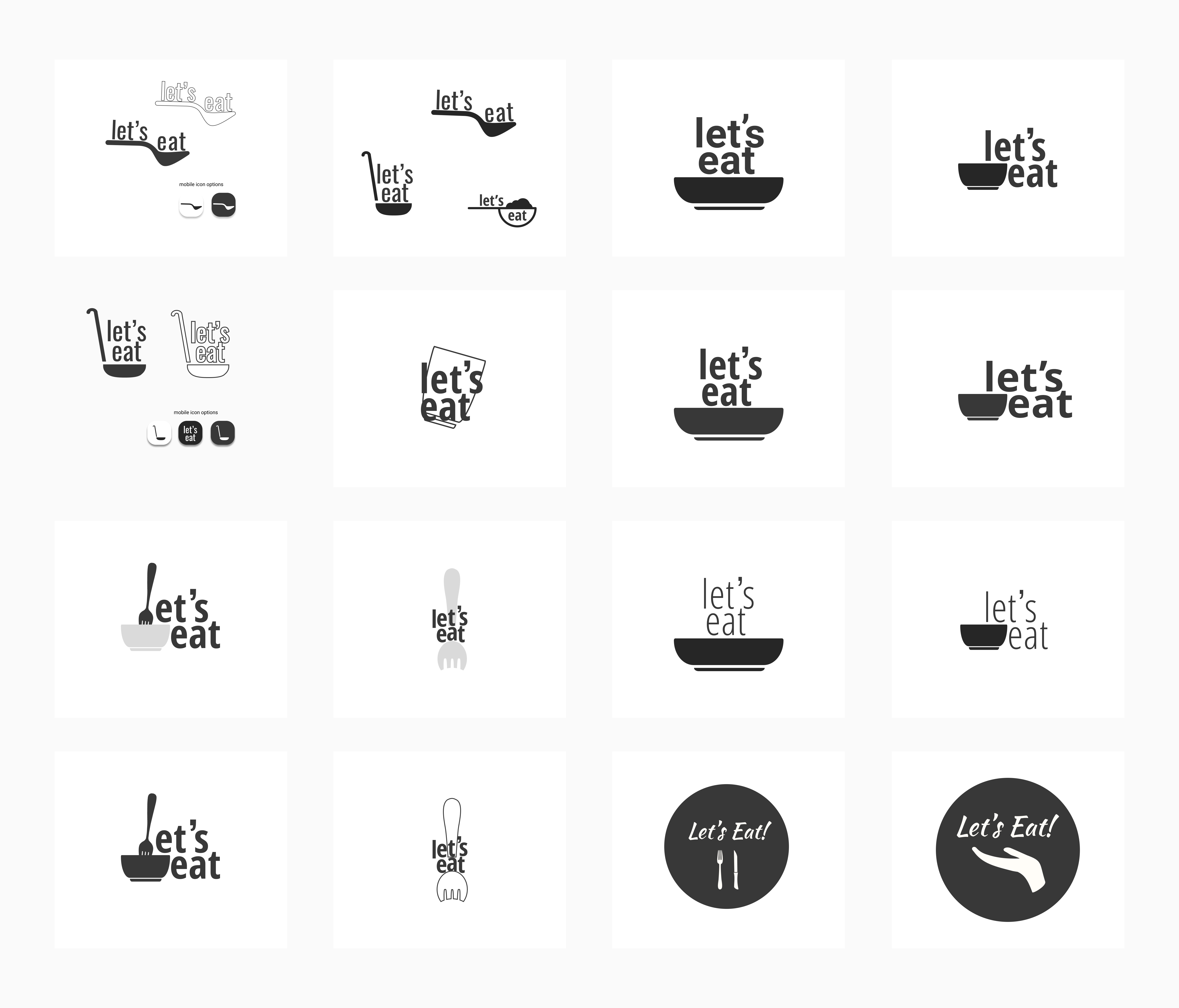
Brainstorming logo iterations


While searching for the right color for this brand, I wanted to find something that embodied the millenial struggle and something that appealed to young professionals - fun, reliable, and vibrant.
Pantone says that Living Coral "symbolizes our innate need for optimism and joyful pursuits - a feeling that, perhaps, people might be craving in today's landscape".
Staying true to the intended nature of the app - being simple to use, it made the most sense to go with a monochromatic color scheme to let the vibrancy of the Living Coral shine through.
For that reason, I decided to pair the coral with warm grays and a soft black.
Deciding to use Roboto as a font type was a no-brainer. It is a popular sans-serif font that many users recognize and has 12 styles within the font family alone. This eliminates the need to pair it with another font to create contrast when needed.


After applying the brand styles to the wireframes, I conducted some more in-person user testing where I asked users to view their notification feed and navigate to an event all the while encouraging them to talk through their journey and provide feedback on all aspects of the flow or design.
While navigating to the notifications feed, some users mentioned that the word “feed” was too similar to the home page in connotation.
In order to address this issue, I came up with two new label names for the notifications tab, "Activity" and "News", and put them forth for some remote preference testing on UsabilityHub.


89% of testers preferred the label "Activity" instead of "News" and some reasons were that:
"The word 'News' can carry a more serious connotation, like a feed of current events or trending topics - things outside the scope of notifications"
"Activity sounds more personal than 'News'"
Another thing some users pointed out was that they were more likely to RSVP yes to an event if they could preview who was coming. Using this feedback, I decided to conduct another preference test for the addition of small profile icons of guests that are attending an event to see which event homepage users liked more.
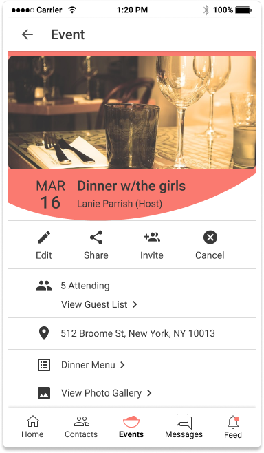

88% of testers preferred an event homepage with the added profile icons, stating that:
"I like having visuals of who is coming to the event"
"My eyes are drawn to the avatars"
"Seeing real people's pictures can help drive the RSVPs"
In the first high fidelity mockup for the event page, there was an idea to maintain a sense of movement within the app by adding an organic circular shape to the top of the screen which can be seen in many other screens throughout the application. Some feedback I received was that the large coral shape was often distracting and disrupted the cohesiveness of the app page.
After some feedback from the senior design team and through some informal user testing, I decided to remove the solid shape as it seemed to create a feeling of separation within the content on the page. Instead, I used the circular shape as a mask for the event hero photo, therefore still incorporating an organic sense of movement within the page without the added distraction.
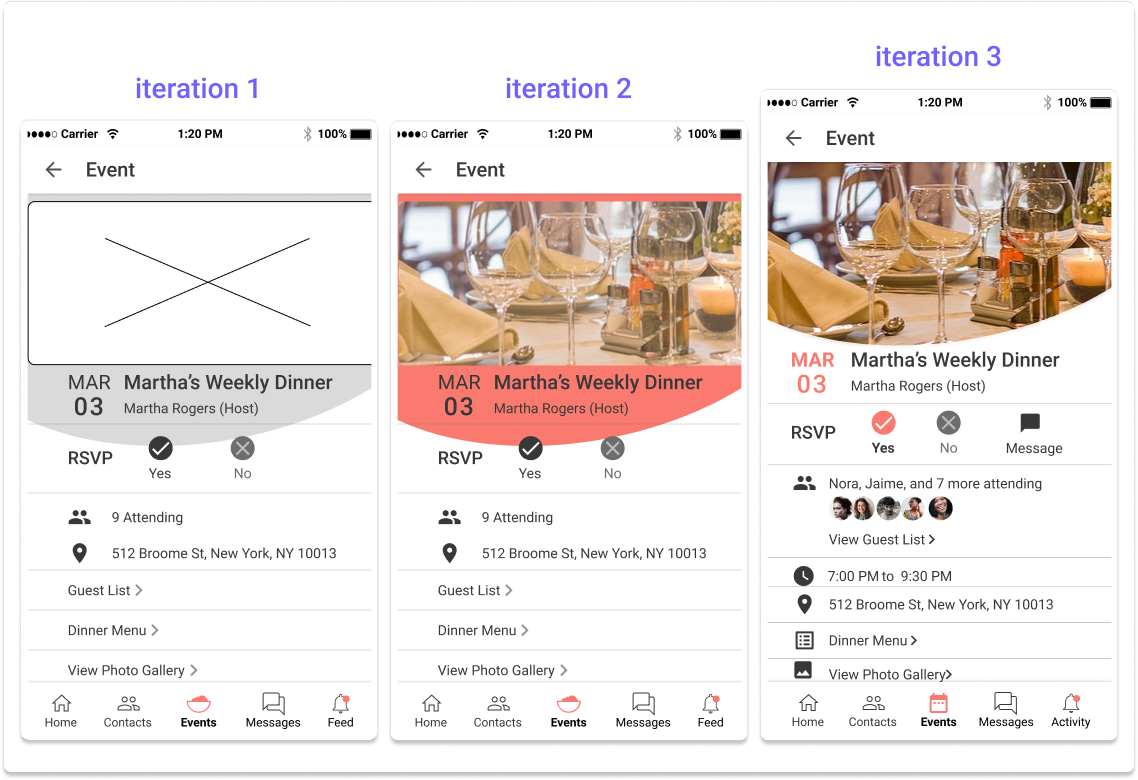
Event page iterations 1-3

In the early versions of this app, user testing revealed that the hamburger side menu might not be as intuitive for some users who are not familiar with the feature and might feel slightly outdated for those who do.
As a way to remedy this, I added a quick on-boarding overlay that informs the user of the existence of a side-menu by showing them how to navigate to it through the profile icon when they first create an account.
I also removed menu options that felt out of place being in the side menu such as “Invite Contacts” and “Sync Calendar”.

Addition of on-boarding screens

Side menu iterations 1-3
This was a great and challenging learning experience for me. Being able to go through all the design process steps and apply user testing methods I learned about and watching the growth and transformation of the application was very exciting.
Let's eat addresses the challenge's criteria by incorporating features of organization, collaboration, sharing, and storing information into a solution to users' pain points and needs in dinner planning.
The overall feedback of the application was that it was very easy to use and very intuitive in it's functions.
Test users complemented the clean UI and said they enjoyed the application design.
Some of the screens still feel crowded, mobile screens only allow for so much real estate that the amount of content and whitespace needs to be more in balance.
User testing user testing user testing.
I would conducting more in-person user task testing and utilize remote preference testing on different screens in order to validate my design choices in the event creation homepage and user flow.
I would also like to explore what features such as external calendar syncing, the ability to create to-do lists, and assigning tasks to event attendees could possibly look like.